You are using an out of date browser. It may not display this or other websites correctly.
You should upgrade or use an alternative browser.
You should upgrade or use an alternative browser.
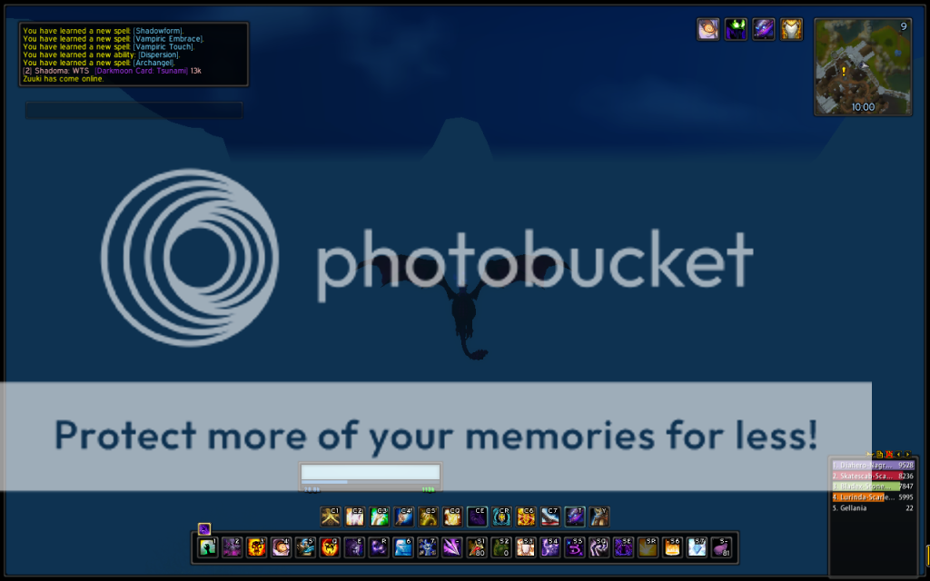
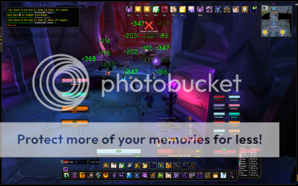
Gellania's UI
- Thread starter Gellania
- Start date
Agree with deniall.
From a DPS pov, you needa see things more than click/mouseover stuff as a healer so if you shifted those to the sides and made them smalller, would be perfect with the relevent cd timers and proc knowledge.
From a DPS pov, you needa see things more than click/mouseover stuff as a healer so if you shifted those to the sides and made them smalller, would be perfect with the relevent cd timers and proc knowledge.
deniall
Guild Leader
- Joined
- May 14, 2009
- Messages
- 10,195
- Points
- 38
- Main Character
- Deny
- Class and Specialisation
- Mage - Frost
Agree with deniall.
From a DPS pov, you needa see things more than click/mouseover stuff as a healer so if you shifted those to the sides and made them smalller, would be perfect with the relevent cd timers and proc knowledge.
Heal and tanks too haha awareness is so important
Gellania
Member
- Joined
- Mar 29, 2011
- Messages
- 492
- Points
- 16
- Main Character
- Gellania
Hm true... I'll try to make some changes and hopefully some new screens next week. Should probably change the raid frames to be horizontally oriented if I shift it to the bottom left though, so that the whole thing looks balanced.
deniall
Guild Leader
- Joined
- May 14, 2009
- Messages
- 10,195
- Points
- 38
- Main Character
- Deny
- Class and Specialisation
- Mage - Frost
I actually like it the way it is")
no point having party frames in a raid, when you've got raid frames o.0